Make Your Text Aesthetically Pleasing
When creating a website or flyer or basically anything with text there are a few some simple things you can take note of to make your text more aesthetically pleasing. Follow these tips and your designs will look amazing.
1)Be clever with your colors.
Use different tones and hues for constancy. Create contracts so it is clear what you are trying to advertise.
2)Use spacing.
Giving each paragraph or line some space lets you shape how your text reads. Group common texts together, and uncommon text (such as titles) separate.
3)Align your text.
Aligning your text gives it structure and symmetry making it easier to understand visually.
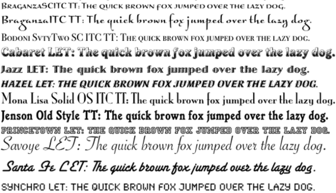
4) Match the font to the mood.
A serif font (rounded edges) is more of an elegant font. But using a san serif font (solid strong straight edges) is more sophisticated.
5)Take a break and come back.
Most importantly, take a break and then come back to your work. A fresh set of eyes can really impact your work.

